STRAIGHTERLINE · 2026
Student Dashboard
Turning a fragmented student experience into a single connected product built for learning and growth.
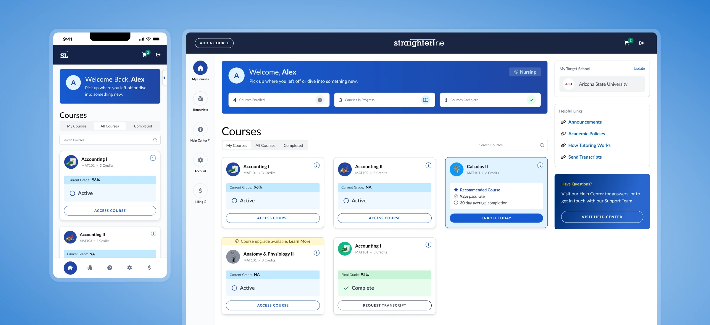
StraighterLine helps students earn affordable college credit with self-paced online courses trusted by colleges nationwide. The student dashboard is their introduction to the product and their home base for courses, transcripts, membership management, and resources.
As product design lead, I partnered closely with Product and Engineering to make the dashboard consistent and accurate across four student membership models, while improving the user journey and turning it into a place where students want to keep learning and buy their next course.
+5% Student Retention
+15% Free Trial Purchase
+20% Coupon vs. Cancel
Challenge
Improve LTV with consistency and clarity.
The business had evolved faster than the dashboard. A recent brand refresh created a disconnect between purchase and product, while new membership models had layered different rules and edge cases onto an increasingly inconsistent experience. At the same time, retention, additional course purchases, and free-trial conversion were declining.
Key Insights
The numbers showed the symptoms. The teams closest to students exposed the problems.
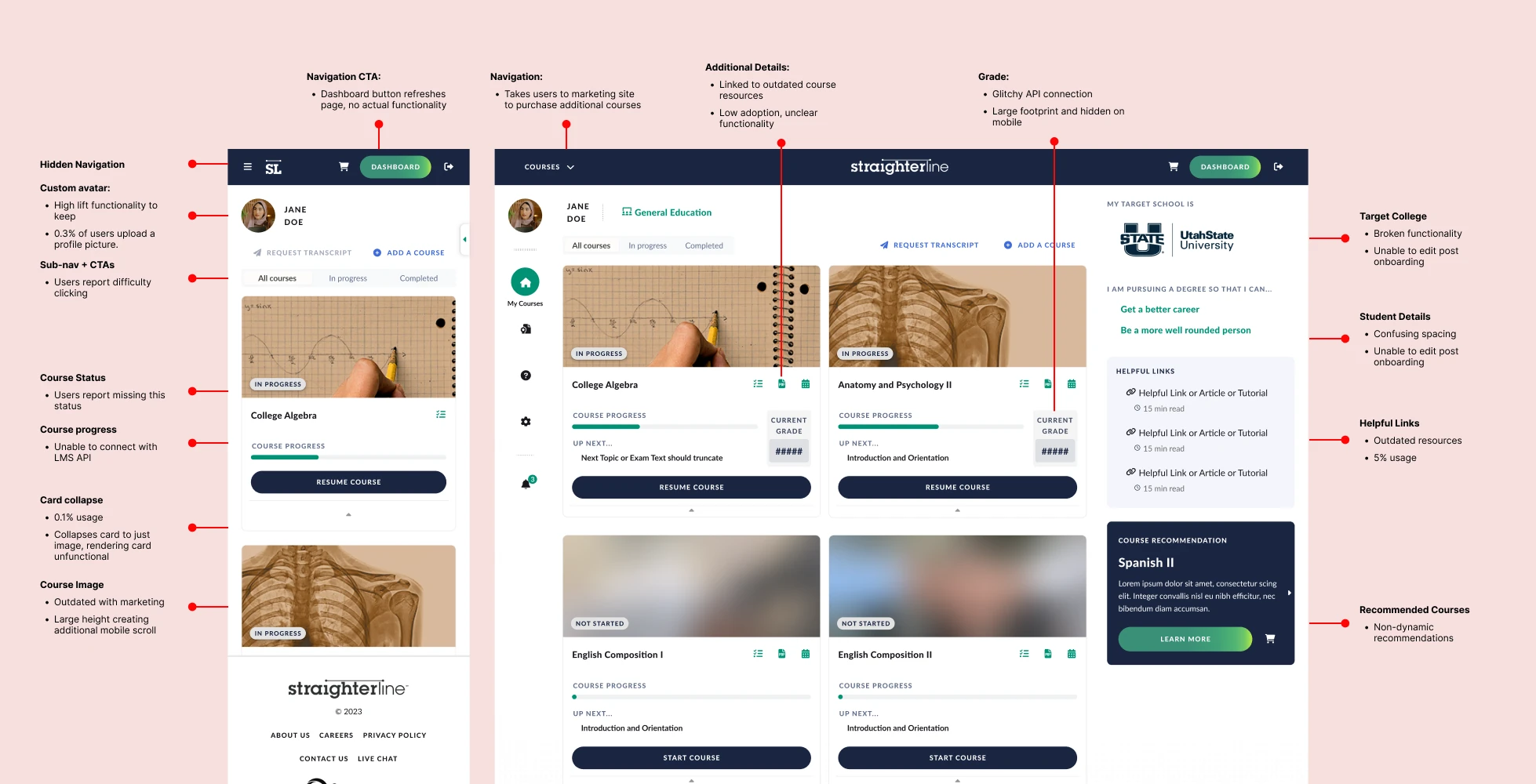
The business goals were clear. The more useful findings came from the teams closest to students: support, who heard what students were confused by, and engineering, who knew where the system broke. They were describing the same problem from opposite ends. Each support ticket marked a place where the dashboard couldn’t answer a student’s question on its own.
High Support Team Volume
What we heard from students:
- Which progress indicator is accurate, inside the dashboard or the course?
- How do I send my transcript? Can I do it myself?
- How does tutoring work?
- How do I add more courses? I have an unlimited access membership.
Technical Difficulties
What we heard from engineering:
- It only takes a single click to cancel, and we don’t know the reason for cancellation.
- We don’t have consistent patterns or language that work across all membership types.
- Occasionally an account is made prior to purchasing a course. Currently, those users land on an empty screen after login.
LTV + Retention Dropping
What the numbers showed, YoY:
- LTV was down. Students weren’t returning to the marketing site to purchase additional college courses.
- Course completion was dropping.
- Cancellation was up, and email marketing was no longer bringing students back at the same rate.
Bug Uncovered
Broken API connection:
Engineering and support surfaced the same bug: the progress shown on a course card never matched the course progress.
The cause was a broken API that required a full platform upgrade, costing almost $1M and migrating 80+ courses. Not in the engineering or academic roadmap. Definitely not in the budget.
Approach
-
Approach 01
Fluid Customer Journey
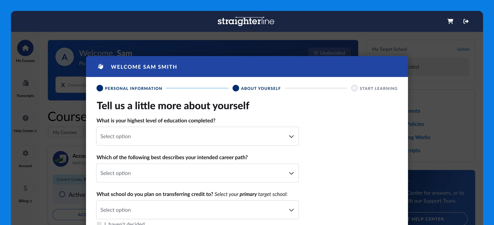
Purchase, the dashboard, and the LMS behaved like disconnected parts of the student journey. Aligning the dashboard with the LMS’s interactions and marketing’s visual language made purchase, onboarding, and every return visit feel like one experience.
User testing and student feedback showed where students got stuck. Onboarding moved to a single page, Transcript and Help Center access appear throughout the dashboard, and profile customization comes after onboarding, each tuned for desktop and mobile, so students can find answers themselves instead of opening a support ticket.
-
Approach 02
Choose Accuracy Over Detail
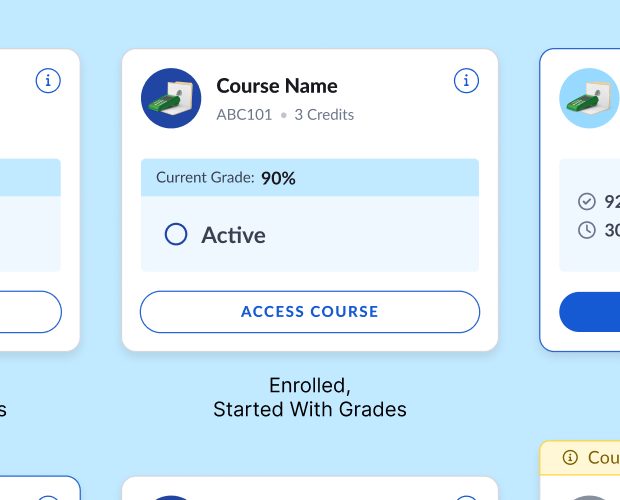
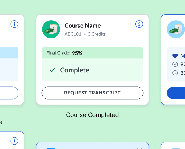
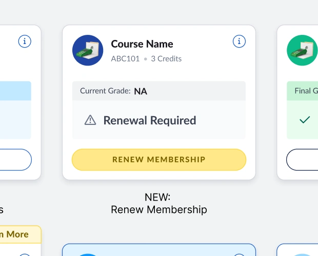
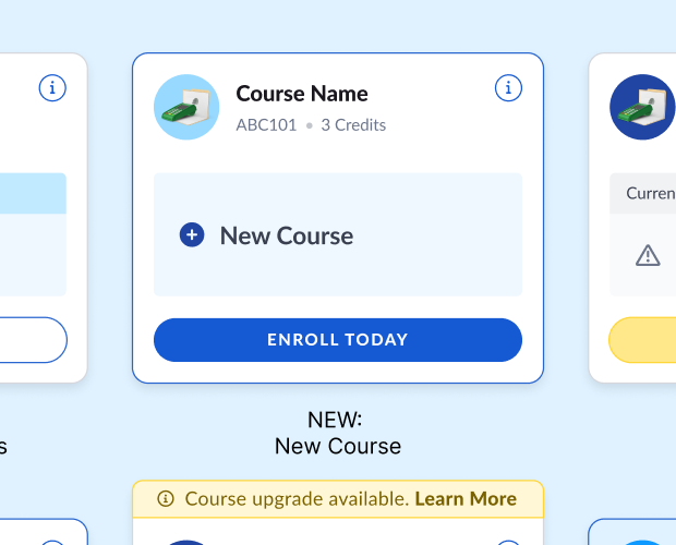
Students didn’t need more progress data if they couldn’t trust it. The API could reliably report a course’s state, but not its detailed progress, and the platform upgrade needed to fix it wasn’t an option.
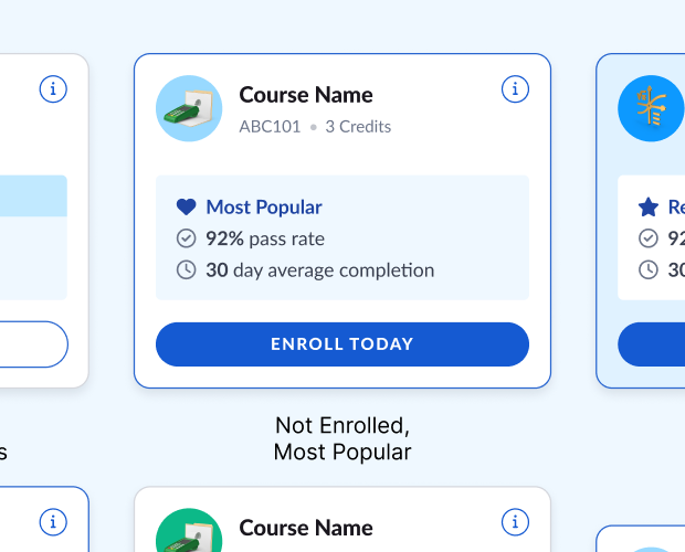
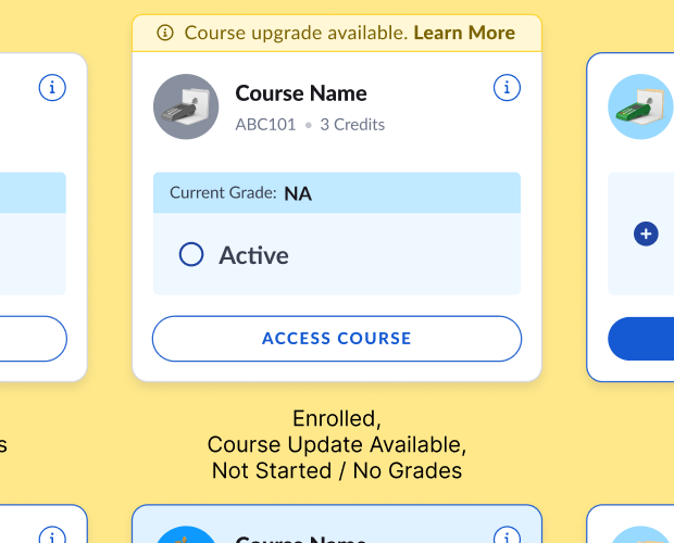
So the dashboard traded a detailed progress bar students couldn’t rely on for a simpler, accurate course status, built on a course-status language that holds up across every state and membership type.
-
Approach 03
Turn the Dashboard Into a Growth Channel
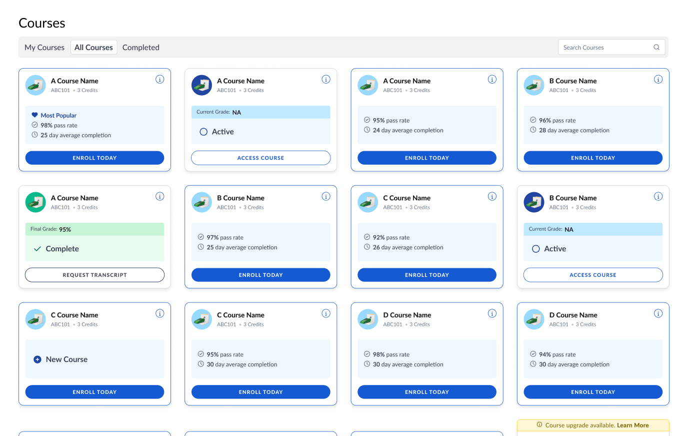
Students who wanted another course were already inside the product, but buying one meant leaving for the marketing site, right when we wanted them to keep going. With LTV falling, I proposed bringing purchasing into the dashboard, aligned Marketing and Engineering on the opportunity, and got the work onto the quarterly roadmap.
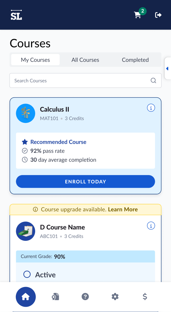
In-dashboard shopping, a dynamic recommended course, self-serve course upgrades, and search shipped together. They mattered most for Free Trial students who hadn’t bought a course yet and Pay-As-You-Go students who could add one. The recommendation also needed a rule for its own success: what to suggest once a student enrolled in the course it had just recommended.
Support asked for one more state: showing students when an updated version of their course was available, so they could upgrade it themselves without a ticket.
+15% Free Trial Purchase
-
Approach 04
Retain Existing Students
Detailed course progress was unreliable, but overall progress could still be shown accurately, so a welcome message and learning summary give students a reason to come back and finish what they started.
Cancelling took a single click and told us nothing about why. I deliberately added friction to cancellation: more than one step, a reason for leaving, and targeted coupon offers. The added step created an exchange: students saw a relevant alternative before leaving, while cancellation reasons created a new source of product feedback. Several rounds of A/B testing landed on an offer that measurably increased LTV (+20% coupon vs. cancel), while the cancellation reasons began informing the product roadmap.
+5% Student Retention
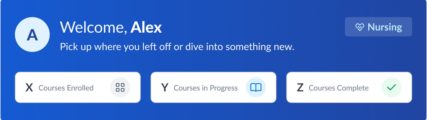
Reporting high level progress in a welcome summary instead of individual, encouraging students to continue positive progress
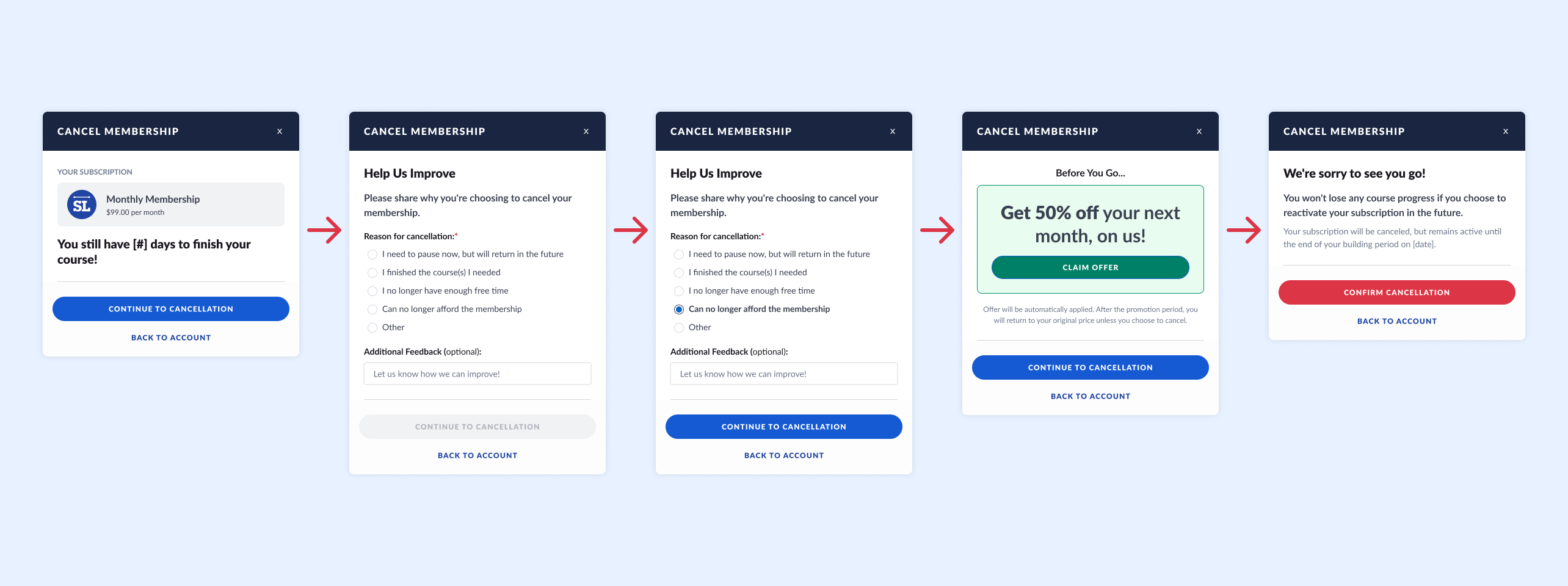
From single button cancellation to adding friction while collecting data and a special offer to stay
-
Approach 05
One System, Four Membership Models
Four membership models didn’t require four dashboards. Pay-As-You-Go, Unlimited Access, Direct Enrollment (usually through an employer’s prepaid learning portal), and Free Trial each had different rules and permissions. I defined one model for when each state, permission, and action appears, with shared status language and patterns, so students never had to see the complexity underneath.
Engineering got documented scenarios for every major case, and we reviewed them together in implementation walkthroughs.
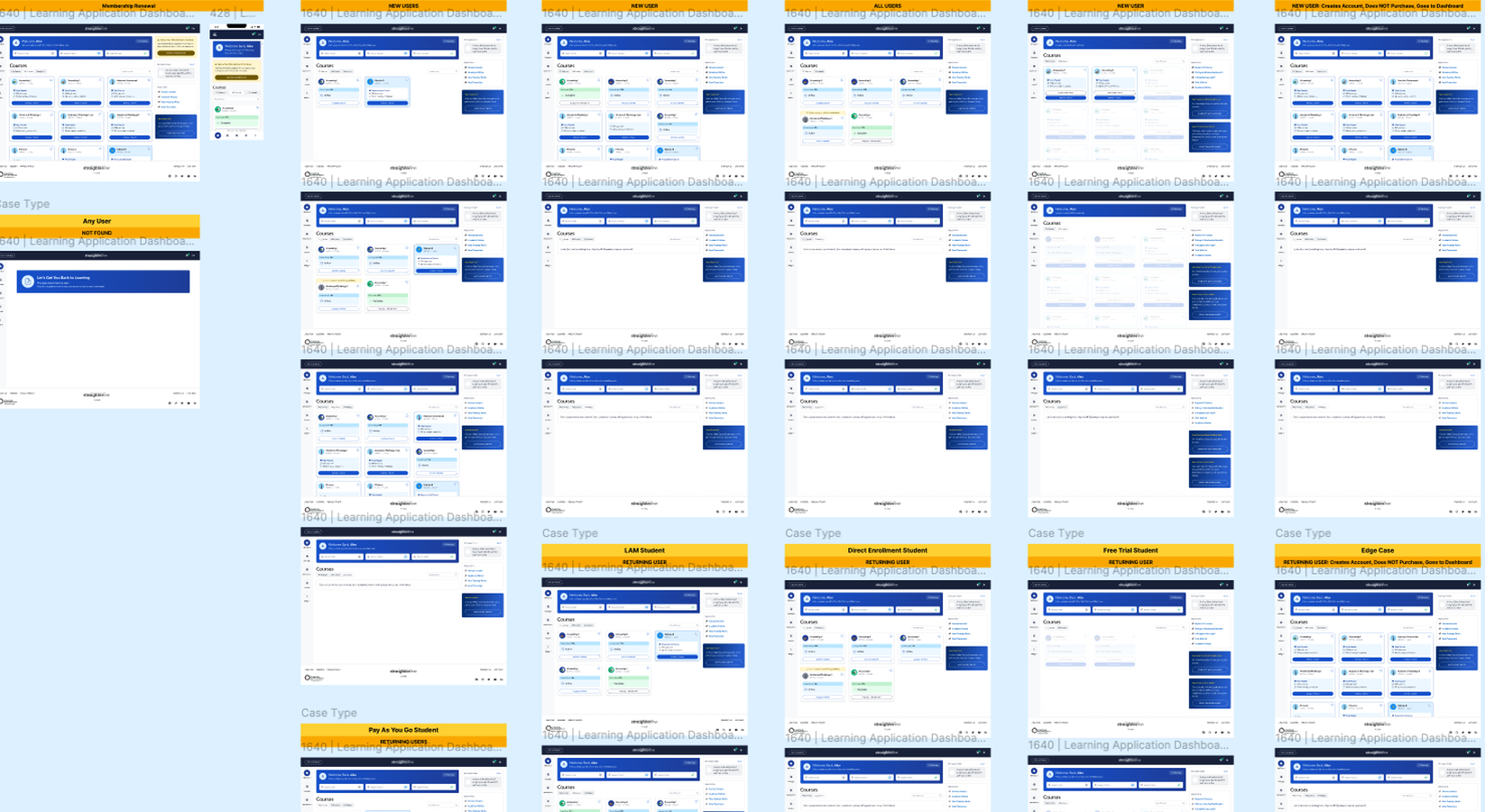
Four membership models, one set of states, permissions, and actions
Solution
One dashboard for every membership model.
The dashboard now supports all four membership models across the full student lifecycle, from first login to buying another course or deciding to cancel.
Students get an accurate course status, purchasing and course discovery inside the product, self-serve upgrades and transcripts, and a warmer first login. Engineering has documented rules for every membership model to build on.
Reflection
The real design problem wasn’t just consistency. It was making four different business models feel like one product.
Most of the work was defining the rules behind the experience and choosing accuracy over detail when the data couldn’t support both.
+20% Coupon vs. Cancel
+5% Student Retention
+15% Free Trial Purchase