STRIDE (K12) · 2024
K–12 Family Onboarding
Turning an inherited onboarding concept into a connected product that could prepare an entire household for the first day of online school.
K12 had an early concept for digital family onboarding and a deadline that wasn’t moving: the first day of school. I led the product design work to turn that starting point into a 25+ screen responsive experience for parents (Learning Coaches, in K12’s terms) and students, working closely with UX Research, Product, Engineering, Marketing, and Academics.
One account could represent multiple students, schools, grade levels, roles, and start dates, which made the problem much bigger than a checklist. Onboarding needed a model that made all of that understandable without asking families to learn another complicated system.
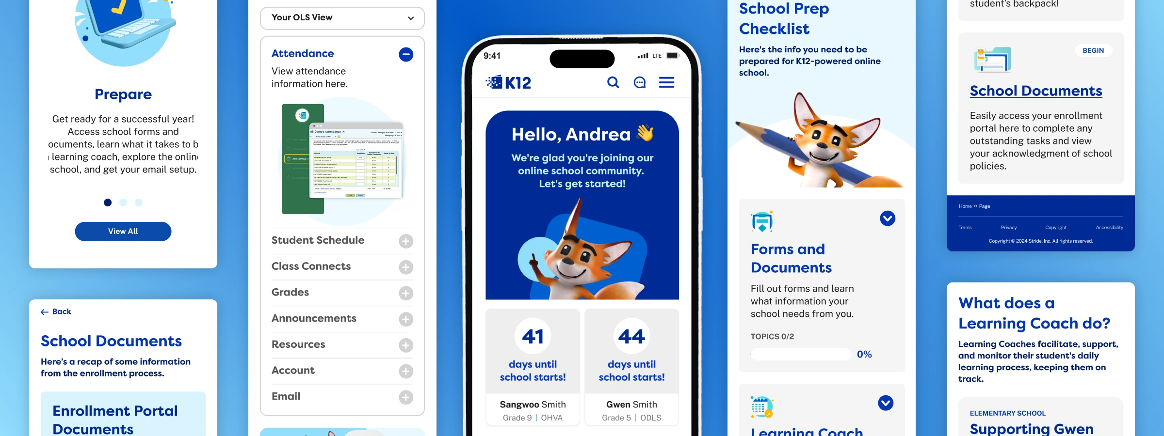
25+ Screens across one connected experience
1 to 4+ Students in one household view
50+ Schools in the 2025 rollout
Challenge
No dedicated onboarding experience before the first day of school.
Families enrolled in online school through a process that involved multiple people, teams, and systems. Once enrollment was complete, nothing helped parents and students prepare for what came next.
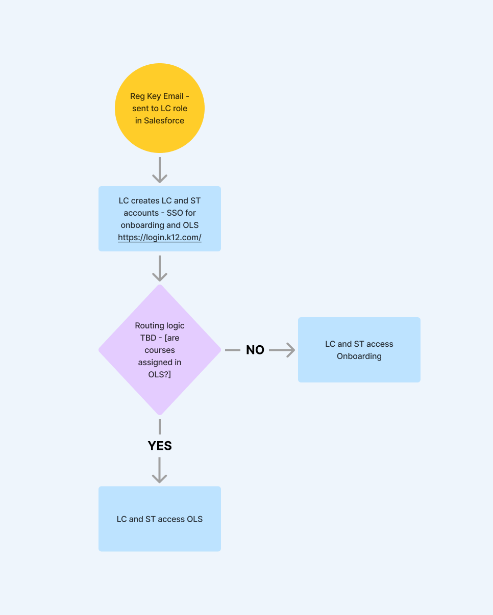
The agency concept I inherited was about nine screens and treated onboarding as a checklist. It hadn’t yet dealt with where onboarding sits: between account creation and K12’s Online Learning School (OLS), the platform where school happens. Early on, even the routing was undecided. Whether a family landed in onboarding or went straight to the OLS depended on whether their courses had been assigned yet.
Parents, known as Learning Coaches, had to understand required documents, technology, materials, and their own role. Students needed a welcoming introduction to online learning. All of it had to work across 50+ schools and systems that didn’t fully talk to each other, and be ready before the school year started.
Key Insights
Families told us what they needed. The build kept telling us what we couldn’t do.
I inherited an outside agency’s initial onboarding concept and wireframes, but no user findings. Working closely with our UX researcher, I joined interviews and testing sessions to hear what families actually needed. Combined with competitor research, those findings led us to start over from scratch.
Research reshaped the product model. Implementation kept reshaping the scope.
Households, Not Individual Students
What we learned from families:
- Parents with more than one enrolled child wanted to see and manage their students together, not in separate experiences.
- One Learning Coach could have students in different schools and grades, with different start dates. The inherited concept treated each student separately.
More Than Two Audiences
What varied from family to family:
- Parents and students shared one journey, but not the same tasks or information.
- Content also varied by grade band, school, and role, and responsibilities shifted with a student’s age and independence.
A Familiar First Day
What the journey required:
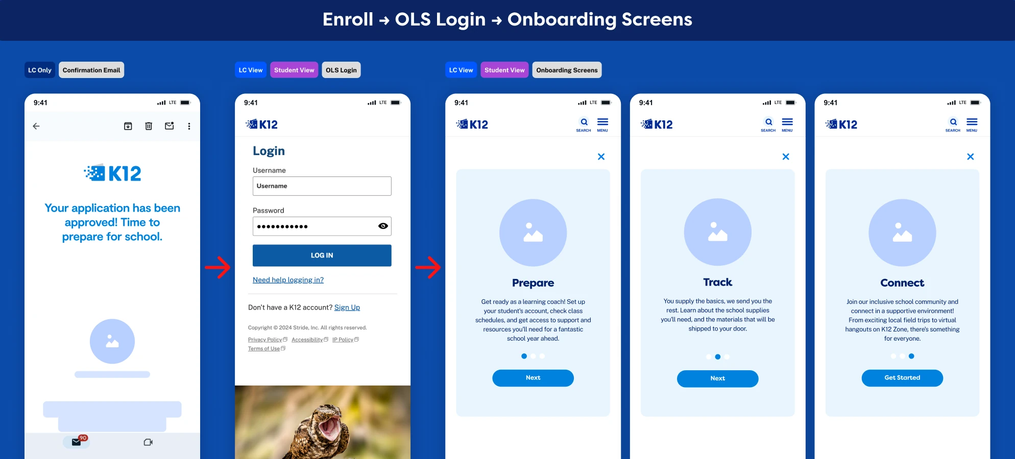
- Families arrived from K12’s marketing site and moved on to the OLS, so onboarding couldn’t feel like a third, disconnected product.
- The experience needed to stay useful after the first day, even as its primary purpose changed.
Separate Systems, Moving Scope
What we learned during implementation:
- Onboarding, the enrollment portal, and the OLS couldn’t exchange all the data we originally expected.
- New requirements kept arriving while the first day of school stayed fixed.
Approach
-
Approach 01
Reorganize Around the Household
The inherited concept was organized around individual students. That isn’t how families work. A Learning Coach with two or three enrolled children wanted one place to see everyone’s start date, school, and progress, not a separate experience to switch between for each child. We reorganized the product around the household.
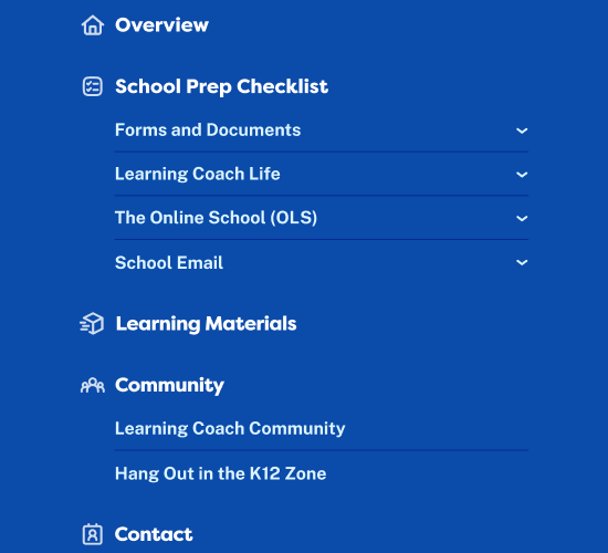
The sidebar and information architecture, defined with our UX researcher, follow that model, and early concepts tested it across the whole journey, from the dashboard through each checklist topic.
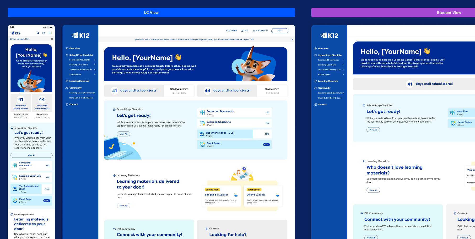
One household view supports one to four or more students. Each student’s countdown, school, and supplies follow documented rules for every family size, and after three, additional students move into a dropdown so the dashboard stays manageable.
Families also wanted to know how much was left to do before school started. Launch requirements already covered FAQs, email setup, Forms & Documents, and the school countdown. I pushed to make the progress tracker a dashboard requirement too, so every household could see what remained.
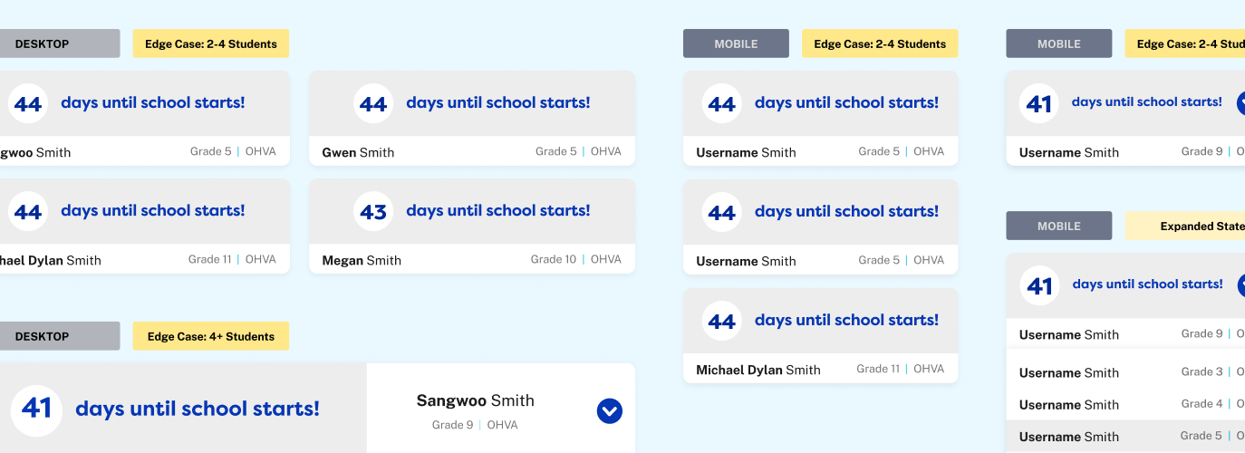
One household view for one to four or more students. After three, students move into a dropdown.
-
Approach 02
One Product, Different Needs
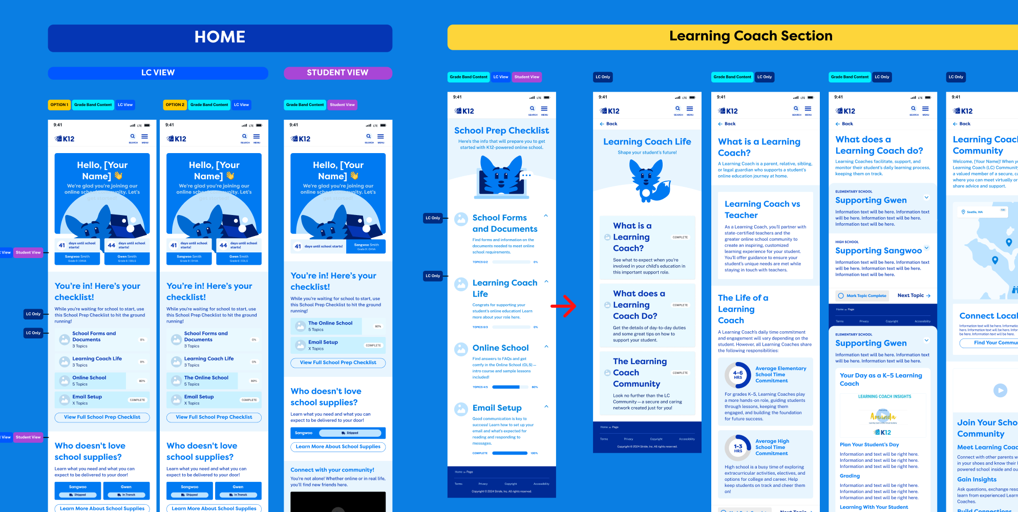
Families didn’t need separate onboarding products. One experience adapts by role, grade band, and school, keeping the underlying product consistent while changing what each audience needs to see.
To keep that manageable, I created a content-tag system in Figma so every screen stated who it was for: LC Only, LC View, Student View, LC/Student Same View, Grade Band Content, and School Content. Product, Engineering, and the content owners could see exactly which version of a page applied to whom.
Students got a simpler product centered on their own onboarding. They saw their own countdown and details, student-focused community content, and fewer tasks. Parent-only areas such as Forms & Documents and Learning Coach Life stayed out of their sidebar and progress tracker, and students never saw content meant for parents or siblings.
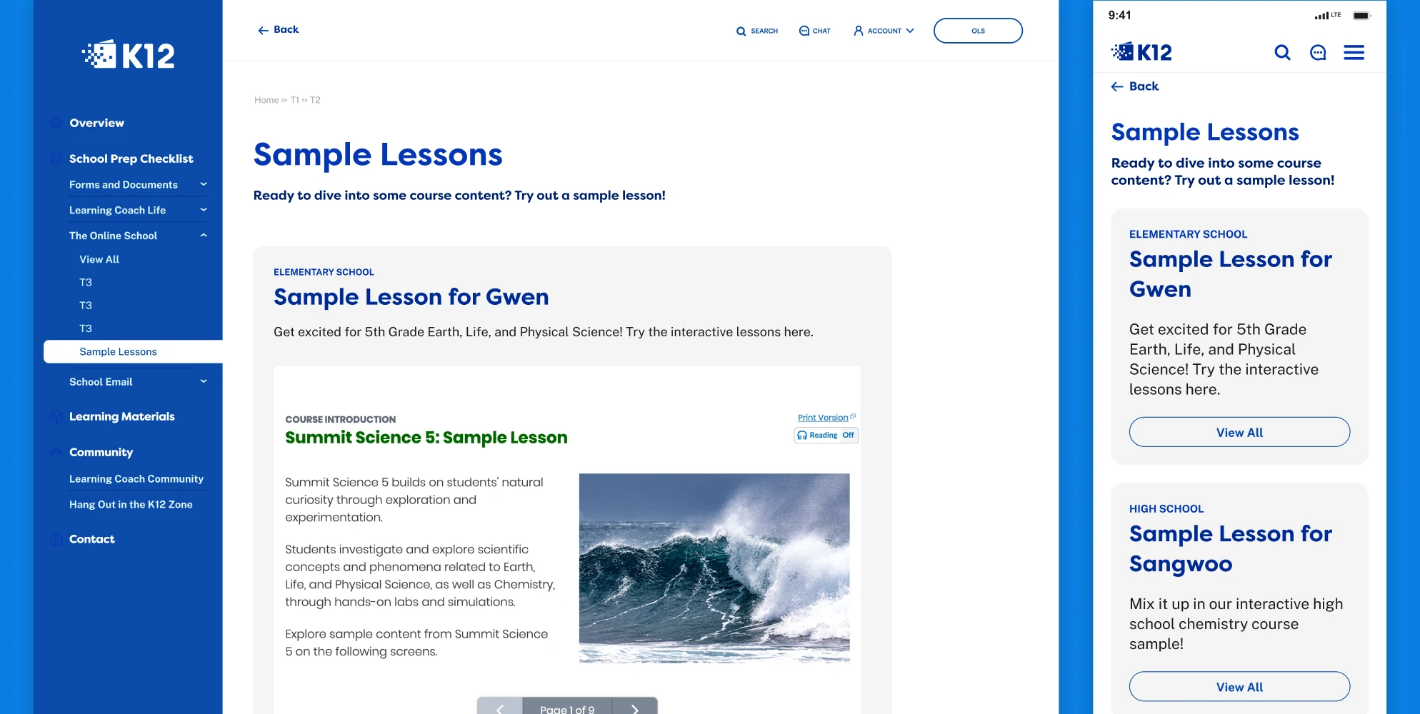
Families had also been asking what online school would feel like. The Academics team supplied real OLS sample lessons, embedded through an iframe and organized by grade, so parents and students could try a lesson before the first day.
-
Approach 03
Design a Truthful MVP
The scope kept growing while the first day of school stayed put. Technical issues, engineering audits, additional testing, and new requirements expanded the timeline and pushed us closer to the start of school. I helped evaluate incoming requests, worked with Engineering on what was realistic for launch, and helped set cutoff dates for new work.
Package tracking was the clearest call. Families receive a school computer, textbooks, and supplies. The full per-student tracker was designed from shipped to arrived. The shipping and order data it depended on came from several systems across the school ecosystem, and it wasn’t reliable enough to trust at launch. A tracker that confidently shows a family the wrong delivery status is worse than no tracker, so the module launched in a Coming Soon state.
The Learning Coach Community got the same treatment. It was a separate product whose launch slipped, so onboarding held it behind a Coming Soon state instead of sending families somewhere that didn’t exist yet.
Progress had a similar problem. Some onboarding activities couldn’t be detected automatically across the systems involved, so the product couldn’t verify every step on its own.
Rather than imply automation that didn’t exist, progress became explicitly self-reported. Families mark each topic complete with a Mark Topic Read button, an info card explains why it matters, and Engineering connected that self-reported progress to the dashboard tracker. It’s less automatic than first planned, but the tracker only shows what a family has told us is done.
We designed everything the experience needed and launched only what the product and its data could honestly support.

Fully designed, launched as Coming Soon. Shipping data from several systems wasn’t reliable enough to show families.
-
Approach 04
Build the System While Building the Product
The existing OLS design foundation was minimal and lived mostly in Sketch, and the organization was moving to Figma. Onboarding had to feel like part of the OLS, so it carried forward the foundation’s colors, button patterns, and sidebar conventions, then extended them in Figma into responsive grids, type, color, iconography, and component states.
Once implementation was underway, Engineering shared the coded grid it was building against. The Figma layouts moved onto that grid and its responsive rules, so design and code worked from one model and later work matched what Engineering was actually building. The 25+ screens were built from those reusable patterns, not as one-offs.
The visual language also moved closer to K12’s marketing site. Families came into onboarding straight from that experience, so enrolling and preparing for school needed to feel like one journey.
Launch
Parent and student experiences launched together.
The Learning Coach and student experiences launched together with select schools for the 2024–25 school year. In 2025, onboarding rolled out to all 50+ schools nationwide.
Families got one place to prepare for the first day: a household dashboard that works for one student or several, content that adjusts by role, grade band, and school, and progress they can see. Behind it are documented rules for every family size and audience, and an expanded set of responsive patterns in Figma that match the code.
My work concluded at Engineering handoff, so I don’t have post-launch product analytics to share.
Reflection
The roadmap changed. The first day of school couldn’t.
Designing against a fixed date means knowing what can flex, what can’t, and what people need to be able to trust.